
Our Favorite WCAG Color Contrast Tool Disappeared — So We Built Our Own
If you work in design, branding or digital communications, you know how important color contrast has become.
One of our go-to resources at Creative Entourage was EightShapes’ Contrast Grid. It made it incredibly easy to compare an entire brand color palette and quickly see which color combinations passed WCAG accessibility standards.
Then it went away.
And we hated to see it go.
We use color contrast testing regularly when developing brand standards, websites and digital communications, particularly for our municipal clients preparing for federal digital accessibility requirements. Testing colors one combination at a time works, but when you're working with a full brand palette, it can be cumbersome.
What we loved about a contrast grid was being able to see the entire palette at once.
So, we built our own.
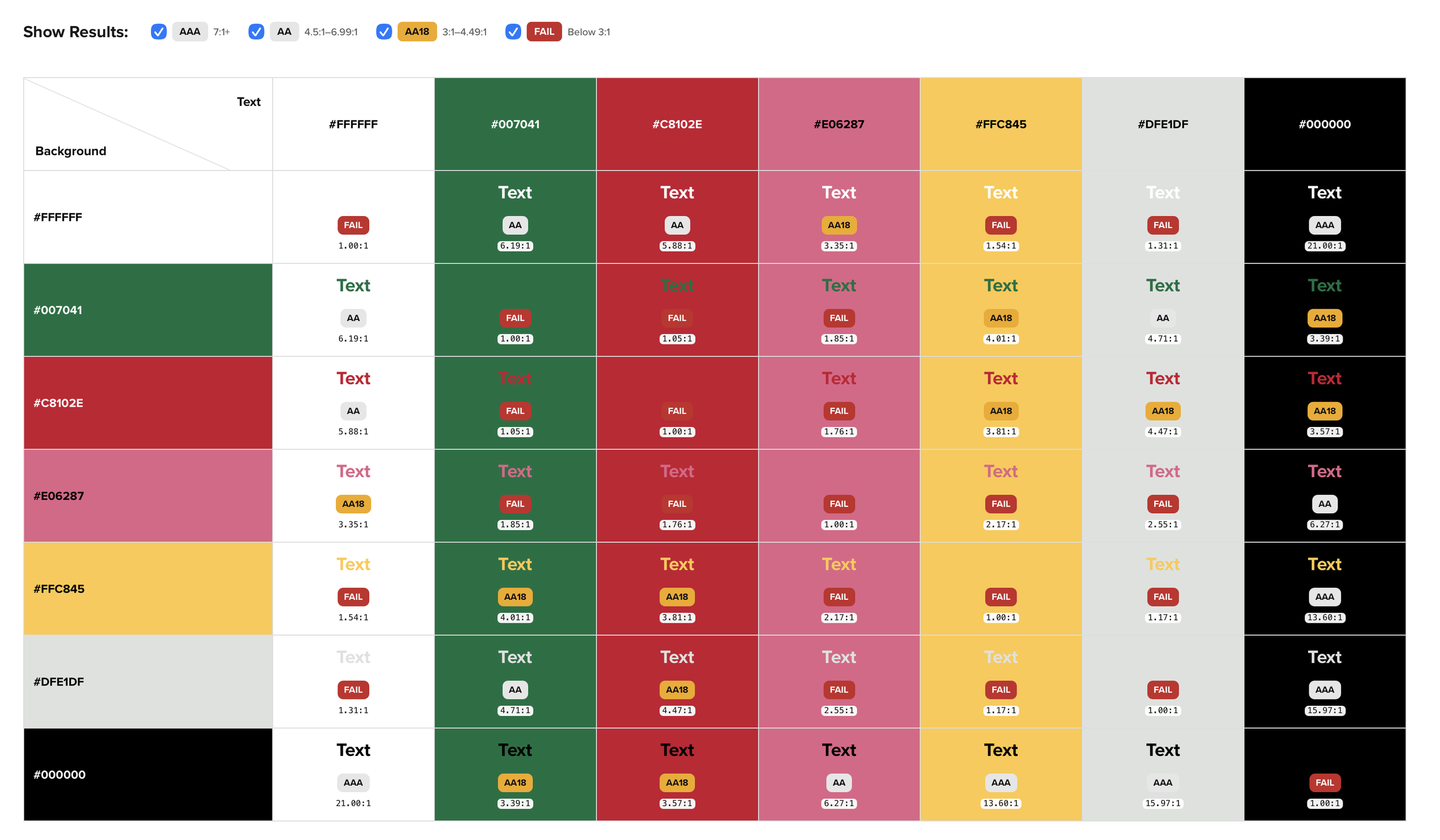
Sample
Introducing Creative Entourage’s Free WCAG Color Contrast Grid
Our free WCAG Color Contrast Grid lets you enter your brand colors and instantly compare them against one another.
The grid calculates the contrast ratio for each combination and identifies whether it meets:
AA — WCAG contrast requirements for normal text
AA18 — WCAG requirements for large text
AAA — Enhanced WCAG contrast requirements
Fail — Combinations that don't meet the applicable contrast threshold
Instead of checking colors individually, you can quickly see which combinations work across an entire palette.
Why Color Contrast Matters
A color palette can look great and still create accessibility problems.
Two colors that appear visually different may not provide enough contrast for someone with low vision or other visual disabilities to comfortably read the content.
That's especially important when brand colors are being used for typography, buttons, website navigation, graphics and other digital communications.
For government organizations, accessibility is also increasingly a compliance issue. The U.S. Department of Justice's accessibility requirements for state and local government web content and mobile apps use WCAG 2.1 Level AA as the technical standard.
That means accessibility needs to be considered when brand standards are created — not just later when someone builds the website.
A Free Tool for Designers, Communicators and Organizations
We originally built this because we needed it ourselves.
But if we've been missing a simple color contrast grid, we're guessing other designers, communications teams and organizations have been too.
So we're making it available for anyone to use — free.
Enter your HEX colors, build your grid and quickly identify which combinations meet WCAG contrast requirements.
Try the Free WCAG Color Contrast Grid
No complicated accessibility software. No checking dozens of combinations individually.
Just a simple tool to help you make smarter, more accessible color choices.
And, yes — we're pretty happy to have our grid back.